

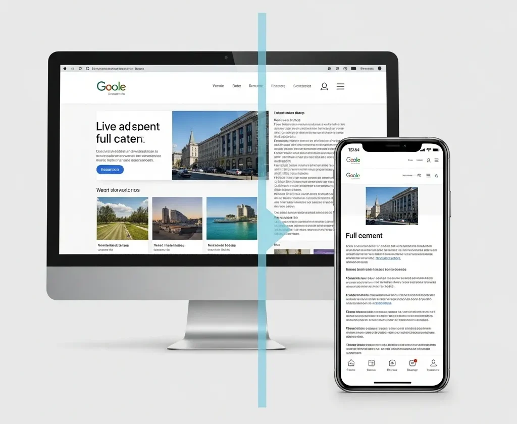
Today, more than 64% of all web traffic comes from smartphones and tablets, making mobile devices the primary way people browse the internet. Because of this shift, having a website that performs well on mobile is essential for keeping users engaged and supporting business growth. A mobile-friendly site automatically adjusts to any screen size, presents clear text, offers straightforward navigation, and loads quickly for every visitor.
This article will show you why mobile optimization is crucial for SEO, explain how Google’s mobile-first indexing can affect your search rankings, and provide practical steps to make your site more mobile-friendly. You’ll also find insights on Core Web Vitals, the latest AI-driven SEO trends, and actionable tips to improve your site’s mobile experience. Whether you work in marketing, development, or run a business, understanding these strategies will help you stay competitive in a world where mobile browsing leads the way.
What Does Mobile-Friendly Mean?
A mobile-friendly website delivers a consistent, seamless experience across all devices. This is achieved through responsive design, where layouts adjust automatically to screen sizes using fluid grids, media queries, and viewport meta tags¹. Key aspects include:
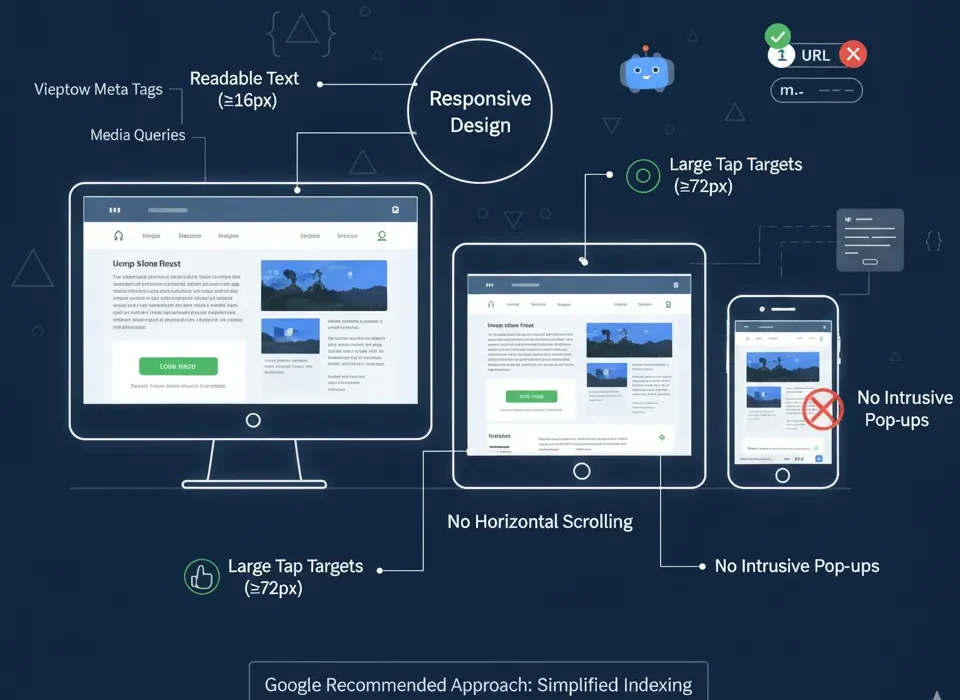
- Readable text without zooming (font size ≥16px)
- Large tap targets (minimum 72px for buttons)
- No horizontal scrolling or intrusive pop-ups
For example, a button designed for thumbs should be wide enough to tap comfortably. Responsive design avoids duplicate URLs (unlike m-subdomains), simplifying search engine indexing. Google explicitly recommends this approach, as it ensures your content is accessible and user-friendly on any device.
Why Mobile-Friendliness Matters for SEO
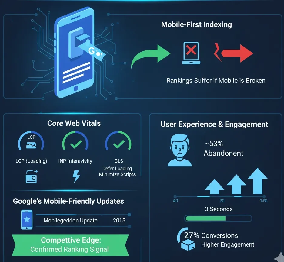
Mobile-First Indexing
Google primarily crawls and indexes the mobile version of websites today. If your mobile site is slow, broken, or poorly designed, rankings suffer, even if the desktop version is flawless. This makes mobile-friendliness a cornerstone of technical SEO.
Core Web Vitals
Core Web Vitals are Google’s official metrics for measuring the real-world user experience of a webpage. They are confirmed ranking signals that are just as important on mobile as they are on desktop. The three primary metrics are:
- LCP (Largest Contentful Paint): Measures loading performance.
- FID/INP (First Input Delay/Interaction to Next Paint): Measures interactivity.
- CLS (Cumulative Layout Shift): Measures visual stability.
To improve these scores, focus on optimizing images by compressing and resizing them, deferring or lazy-loading offscreen content, and minimizing heavy scripts that can slow down the page. Achieving good Core Web Vitals scores means your pages will load quickly and run smoothly on mobile devices, which keeps users happy and improves your SEO.
User Experience & Engagement
Poor mobile experiences drive users away:
- ~53% of mobile visitors abandon sites taking >3 seconds to load.
- Mobile bounce rates average ~50%, 10–20% higher than desktop.
Improving mobile speed by 1 second can boost conversions by up to 27%.
Google’s Mobile-Friendly Updates
Since 2015’s “Mobilegeddon” update, Google has rewarded mobile-optimized pages. Mobile usability remains a confirmed ranking signal, giving compliant sites a competitive edge.
Emerging SEO Considerations
Google AI & Meta Descriptions
Google is increasingly using AI, such as its Gemini model, to generate search snippets and meta descriptions directly in the search results. In some tests, a site’s own meta description is entirely replaced by an AI-written summary. This means your on-page content must be obvious and concise, allowing Google’s AI to accurately interpret and summarize your page’s topic for a helpful snippet.

In practice, continue writing meta descriptions and headings that align with user intent, but also ensure your page copy is well-structured and stands on its own. Even if Google rewrites your description, explicit and authoritative content will lead to a better AI-generated snippet and a higher click-through rate.
Mobile & Bilingual Snippets
Mobile search results often feature rich snippets, local information packs, and other enhanced features. To maximize your global reach, consider implementing multi-language content and the appropriate tags. If you serve international audiences, using hreflang attributes and providing translations helps Google show results in a user’s preferred language. Localized snippets make your site more visible and accessible to users searching in different languages.

Additionally, optimize for “mobile SERPs” by including structured data like FAQs or How-to schemas. This makes your site eligible to appear in mobile knowledge panels or be used in voice search results. A well-structured, mobile-friendly site is more likely to earn these special features on small screens.
Click-Through Rate (CTR) & Engagement
While Google maintains that CTR is not a direct ranking factor, a compelling title and snippet can significantly boost clicks and user engagement, on mobile devices, where screen space is limited, concise titles and snappy meta descriptions are essential for standing out. Remember that Google’s AI might alter your snippet, so keep your titles and opening sentences strong, relevant, and attention-grabbing.

A higher CTR and longer time spent on your site signal to Google that users find your content valuable. When combined with excellent mobile-friendliness, this positive engagement can indirectly support your SEO efforts by driving more qualified traffic.
Tips to Make Your Site Mobile-Friendly
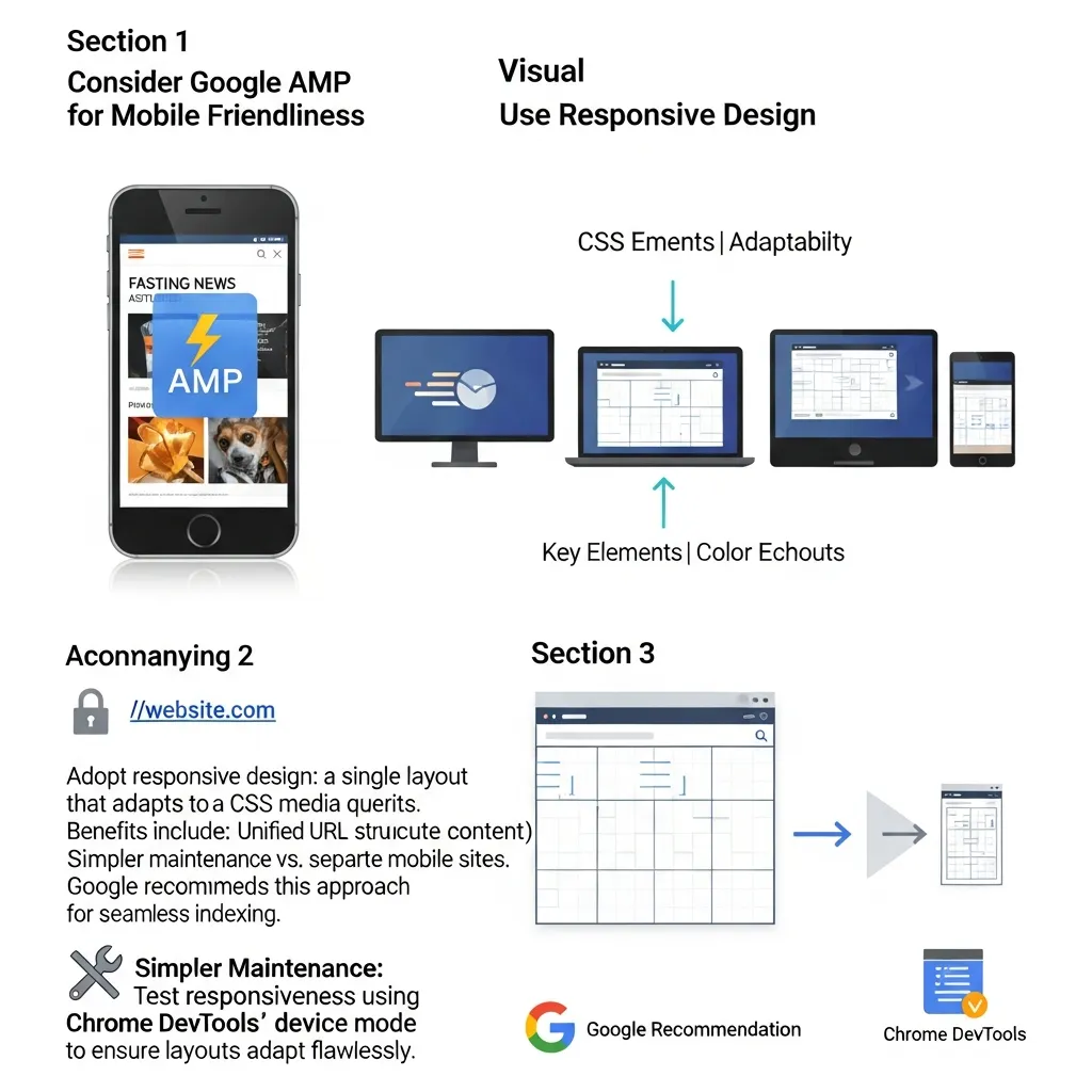
Consider Google AMP for Mobile Friendliness
Use Responsive Design
Adopt responsive design: a single layout that adapts to all devices via CSS media queries. Benefits include:
- Unified URL structure (avoiding duplicate content)
- Simpler maintenance vs. separate mobile sites
Google recommends this approach for seamless indexing.
Test responsiveness using Chrome DevTools’ device mode to ensure layouts adapt flawlessly.
(Optional) Google AMP
Accelerated Mobile Pages (AMP) enable near-instant loading, primarily benefiting news sites. While not required for SEO, AMP can improve visibility in mobile search results. Focus instead on Core Web Vitals optimization for broader impact.
Create Mobile-Friendly Content
Mobile readers scroll quickly. Optimize content by:
- Using short paragraphs (1–2 sentences)
- Employing bullet points and subheadings
- Ensuring buttons/links are easy to tap (72px minimum)
Prioritize scannable content and avoid dense text blocks. For example, headlines should include target keywords early to aid readability.

Make Navigation Mobile-Friendly

Simplify your site’s navigation for touch screens. Use a “hamburger” menu (the three-line icon) or expandable sections to house deeper menu items, preventing long navigation bars from cluttering the screen. Ensure all menu text is large and easy to read.
All buttons and links must have sufficient padding to allow users to tap them accurately without “fat-finger” errors. Placing key links near the top of the page or using a sticky header that remains visible as users scroll can also make it much easier to navigate on small screens.
Avoid Intrusive Interstitials
Do not use full-screen pop-ups or other intrusive ads that block content on mobile devices.
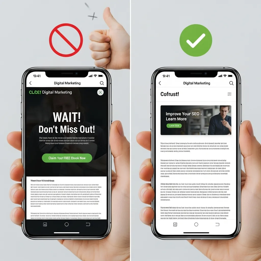
Google penalizes sites that force mobile users to dismiss an ad or overlay before they can access the main content. This practice creates a poor user experience and can negatively impact your search rankings.
If you need to display a promotion, use small, unobtrusive banners or exit-intent pop-ups that are easy to close and do not disrupt the user’s journey.
Maintain Content Parity
Ensure that the content and metadata on your mobile site match those on your desktop site. Do not hide important text, links, or structured data from the mobile version.
Because Google uses mobile-first indexing, it expects the mobile and desktop versions of a page to be equivalent. Maintaining content parity ensures that your full content is indexed correctly and has the best chance to rank.
Testing and Monitoring
Regularly use Google’s suite of tools to check your site’s mobile-friendliness. The Mobile-Friendly Test, available online,

will tell you whether Google considers your page mobile-friendly and list any specific usability issues it finds.
Use PageSpeed Insights to get a detailed mobile performance report, complete with actionable suggestions for improvement. Also, monitor the Mobile Usability and Core Web Vitals reports in Google Search Console to identify any errors affecting your site. Proactive monitoring helps you catch and fix mobile issues before they impact your rankings.
Make your content mobile-friendly
To make your content mobile-friendly, focus on creating a seamless experience for users on smartphones and tablets. Start by using a responsive design that automatically adjusts to different screen sizes, ensuring text remains readable and navigation stays simple. Prioritize fast load times by optimizing images and minimizing unnecessary code to keep visitors engaged.
Additionally, use clear headings and concise paragraphs to make information easy to scan.

Avoid small fonts and crowded layouts, as these can frustrate mobile users. Test your site regularly on various devices to catch any issues and refine the user experience. By following these steps, you’ll create content that’s accessible, engaging, and effective for mobile audiences.
Optimize for mobile SERPs
Optimizing your site for mobile search results is essential as more users rely on smartphones and tablets to browse the web. By focusing on a smooth, fast, and user-friendly mobile experience, you can improve your rankings and keep visitors engaged. Here are the key strategies to help your site perform better in mobile SERPs:
- Use a responsive design that adapts to any screen size.
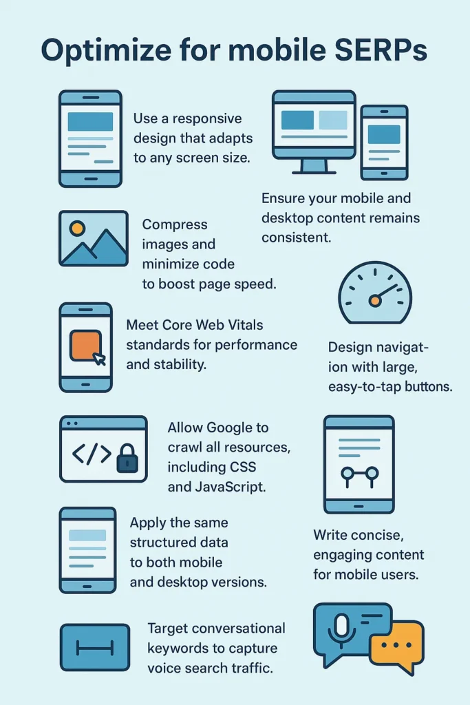
- Ensure your mobile and desktop content remains consistent.
- Compress images and minimize code to boost page speed.
- Meet Core Web Vitals standards for performance and stability.
- Design navigation with large, easy-to-tap buttons.
- Keep layouts simple and clutter-free.
- Allow Google to crawl all resources, including CSS and JavaScript.
- Apply the same structured data to both mobile and desktop versions.
- Write concise, engaging content for mobile users.
- Target conversational keywords to capture voice search traffic.
Include mobile-friendly navigation
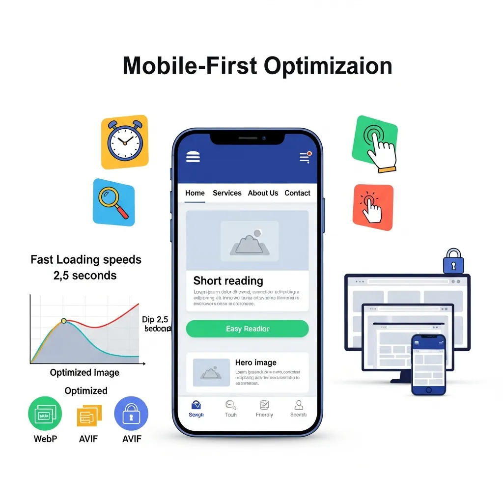
Mobile search success demands more than a shrunken desktop site. With Google prioritizing mobile versions for rankings, you need a mobile-first approach. Here’s how to optimize for mobile SERPs:
• Go fully responsive: Your site must adapt seamlessly to any screen size. Keep mobile and desktop content identical to maintain rankings.
• Simplify navigation: Use hamburger menus or bottom navigation bars instead of complex dropdowns. Make buttons at least 44 pixels square with clear labels. Sticky navigation helps users stay oriented.
• Prioritize speed: Compress images with WebP or AVIF formats. Enable lazy loading. Hit key metrics: main content under 2.5 seconds, button response under 200 milliseconds, minimal layout shift.
• Design for touch: Space elements generously. Use short paragraphs and clear headings. Skip intrusive pop-ups. Place necessary actions within thumb reach.
Keep your content the same.
Keeping your content the same across mobile and desktop versions is essential for strong search rankings and a consistent user experience. Google’s mobile-first indexing means the mobile version of your site is the primary one used for ranking, so any missing or different content can hurt your visibility in search results. Make sure all text, images, structured data, and metadata are identical across both versions to ensure users and search engines receive the same information, regardless of device. This approach also helps maintain trust and avoids confusion for your audience.
Avoid intrusive interstitials
To avoid intrusive interstitials, use small banners or notifications that don’t block the main content, especially when users arrive from search results. Make sure any pop-ups are easy to dismiss, appear only after users have engaged with your site, or are triggered by exit intent rather than immediately on page load. Only use full-screen interstitials when legally required, such as for cookie consent or age verification. By keeping overlays minimal and non-disruptive, you’ll protect your search rankings and improve the mobile user experience.
Review mobile performance
To review mobile performance, test your site on various devices and networks to ensure fast load times, smooth navigation, and reliable functionality. Use tools like Google PageSpeed Insights, GTmetrix, and WebPageTest to check speed, Core Web Vitals, and usability. Focus on key metrics such as load time, responsiveness, layout stability, and resource usage, and regularly address issues like large images or inefficient code to keep your mobile experience optimized.
Track rankings on a mobile device
You can track your search rankings on a mobile device using specialized SEO tools that offer mobile-specific data and device-based tracking. Tools like Google Search Console, Ahrefs, SEMrush, Serpstat, Mangools SERPWatcher, and ProRankTracker allow you to monitor keyword positions, compare mobile and desktop rankings, and analyze performance by location and device type.
How to Check Your Site’s Mobile-Friendliness
Ensuring your website is mobile-friendly is an ongoing process, not a one-time task. Regularly using a combination of automated tools and manual checks will help you identify and fix issues before they impact your users and your SEO. Here’s a more in-depth look at the essential tools and methods for testing your site’s mobile performance.
Google’s Mobile-Friendly Test
Use this tool for a quick, page-level pass/fail analysis. It instantly tells you if Google considers a page mobile-friendly and flags fundamental issues like small text or content wider than the screen.
PageSpeed Insights (PSI)
Go beyond a simple check to analyze performance. PSI provides a mobile speed score, assesses Core Web Vitals (LCP, FID, CLS), and offers actionable recommendations to address technical bottlenecks, such as optimizing images and scripts.
Chrome DevTools (Device Mode)
Simulate various mobile devices in real-time directly in your browser by pressing F12. This allows you to test responsive layouts, touch interactions, and how your site performs on slower network connections.
Google Search Console
Monitor your entire site’s mobile health over time. The Mobile Usability report automatically identifies site-wide errors (like “Clickable elements too close together”) and lists all affected pages, helping you manage issues proactively.
Real-World Testing and Analytics
Don’t rely solely on tools. Test your site on physical phones and tablets. Additionally, check Google Analytics for high mobile bounce rates or low session durations compared to desktop—these are clear indicators of usability problems.
Final Thoughts
Mobile-friendliness is no longer optional; it’s required for modern SEO success. A site that works well on smartphones keeps users happy and ranks better in Google’s search results. By using responsive design, optimizing performance, and creating touch-friendly content, businesses can reach more customers on mobile devices.
At SEO Services BD, our technical SEO experts ensure your site meets all mobile-friendly standards and modern SEO best practices. A mobile-optimized site positions you as a trustworthy, authoritative brand online.
FAQ
What’s the difference between “mobile-friendly” and “responsive design”?
This is one of the most common points of confusion.
Responsive Design is the modern method for making a site mobile-friendly. It uses a single, flexible layout that automatically adapts to fit any screen size, from a phone to a desktop. Today, responsive design is the standard and what Google recommends.
Mobile-Friendly is a broad term that means a site works on mobile without significant issues, such as horizontal scrolling or unreadable text. In the past, this sometimes meant having a separate, stripped-down mobile site (like m.example.com).
Do I need a separate mobile website (m.) anymore?
No, this practice is outdated. Having two separate sites for desktop and mobile is difficult to maintain and can harm your SEO. The best practice is to have a single responsive website that works on all devices, ensuring a consistent user experience and easier indexing by Google.
My site looks okay on my phone. Is that good enough?
Not necessarily. Your personal experience is a good start, but it isn’t a reliable test. Different phones have different screen sizes and browsers. A site might look fine on your iPhone but break on an Android device. It’s crucial to use official tools like Google’s Mobile-Friendly Test and PageSpeed Insights to get an objective analysis of how Google sees your site and to identify specific technical issues.
What is “mobile-first indexing” and how is it different from just being mobile-friendly?
- Mobile-Friendly is about ensuring a good user experience on mobile devices.
- Mobile-First Indexing is how Google crawls and ranks your site. It means Google primarily uses the mobile version of your website to understand your content and determine your ranking in all searches (both mobile and desktop). If your mobile site has less content than your desktop site, you risk losing rankings because Google won’t see that hidden content.
Will a non-mobile-friendly site be penalized by Google?
Yes. Since Google’s “Mobilegeddon” update in 2015, mobile-friendliness has been a direct ranking signal. If your site is not mobile-friendly, it will rank lower in mobile search results. With mobile-first indexing now the standard for all websites, a poor mobile experience can negatively impact your rankings on desktop searches as well.
Do pop-ups hurt my mobile SEO?
Yes, intrusive pop-ups (interstitials) that block the main content as soon as a user lands on a mobile page can lead to a Google penalty. These are frustrating for users on small screens. If you must use them, opt for smaller, less intrusive banners that are easy to dismiss.
If most of my customers use desktop, do I still need to worry about mobile-friendliness?
Absolutely. Even if your analytics show most conversions happen on desktop, Google still uses your mobile site for indexing and ranking. A poor mobile site will hurt your visibility across all devices. Furthermore, many users discover a brand on mobile and later return on a desktop to complete a purchase. A bad first impression on mobile can lose you that customer forever.
What’s the first step I should take to check my site?
The most straightforward first step is to use Google’s Mobile-Friendly Test tool. Just enter your website’s URL, and it will give you a clear pass-or-fail result and list any immediate problems it finds. From there, you can use Google Search Console for a more detailed, site-wide analysis.