

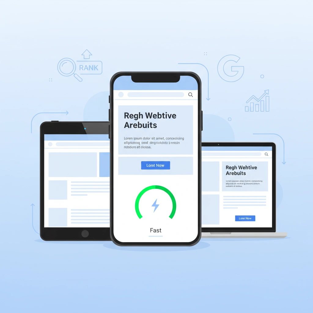
Smartphones now power nearly 60% of global web traffic. Businesses that ignore mobile experiences risk losing massive audiences. They also miss crucial growth opportunities.
This mobile dominance changes everything. Sites must load quickly on handheld devices. Easy navigation becomes essential. Both factors directly impact customer retention and sales.
Mobile optimization refines your website for smaller screens. It ensures smooth, intuitive interactions. Buttons and text become accessible without constant zooming or adjusting..
In today’s fast-paced digital world, mobile-friendly sites better meet user needs. Search engines also prioritize these optimized experiences. The result is improved visibility and higher rankings.
This guide delivers practical strategies for mobile compatibility. You’ll learn to boost user engagement effectively. We’ll also show you how to improve search performance in our increasingly mobile world.
What Is Mobile Optimization?
Mobile optimization involves refining websites for smartphones and tablets. It focuses on responsive design that automatically adjusts layouts. Different screen sizes require dynamic adaptation. Rapid loading keeps users engaged without frustrating delays.
This process ensures smooth functionality across all devices. Images must be optimized for faster loading. Code needs streamlining to improve performance. Every element is designed to meet the constraints of portable devices.
Desktop sites benefit from large screens and precise mouse clicks. They can include complex menus and detailed visuals. Mobile setups work differently with compact displays. Content must be scannable and easy to read.
Touch-friendly features prevent user frustration. Spacious buttons help avoid accidental taps.
Google’s mobile-first indexing changed everything for website owners. The search engine primarily crawls mobile versions now. It uses these mobile pages for ranking decisions. This shift was fully implemented by 2021. Site owners must maintain equal content across platforms. Both versions require the same level of quality for optimal performance.
Why Mobile Optimization Matters Globally
Mobile devices generated over 62% of worldwide web traffic in 2025. This trend is growing stronger in Asia and Africa, where smartphones are the primary means of internet access. Sites must adapt across borders, handling varying network speeds and device types.

Optimized mobile experiences keep visitors engaged longer. They cut bounce rates by 50% and boost conversions through faster, smoother interactions. Users stay loyal when browsing feels effortless.
Search engines reward mobile-friendly sites with higher rankings. Fast, user-focused designs gain visibility in international results. This helps brands reach diverse markets and beat competitors.
Use Responsive Design for All Devices
Responsive design ensures websites adapt to any screen size. It uses CSS media queries to detect device characteristics and apply appropriate styles. For example, columns stack vertically on phones but expand on tablets, all without page reloads.
This approach works globally across budget smartphones and premium tablets. Users get consistent experiences regardless of their device or network speed. Google prefers responsive design because it simplifies mobile-first indexing and avoids duplicate content issues.
Avoid common mistakes, such as separate mobile URLs (m.example.com), which can cause redirect issues.

Stick to unified URLs for better performance. If switching from older systems, use canonical tags temporarily, but prioritize full responsive implementation.
Improve Site Speed and Performance
Understanding Core Web Vitals: Google’s Speed Metrics
Site speed is crucial for mobile SEO. Google’s Core Web Vitals measure key aspects:
- Largest Contentful Paint (LCP): Main content should load in under 2.5 seconds.
- Cumulative Layout Shift (CLS): Keep layout shifts below 0.1.
- Interaction to Next Paint (INP): The site should respond to user actions within 200 milliseconds.

These metrics directly affect search rankings. Fast, stable, and responsive sites rank higher, while slow or unstable ones lose visibility. Optimize images, minify code, enable caching, and use a CDN to improve performance.
Technical Optimization Strategies for Faster Loading
Improving your website’s performance involves several key steps:
Compress Images: Use formats like WebP and image optimization tools to reduce file sizes without losing quality.

Use a CDN: Deploy a Content Delivery Network to serve assets from servers closest to your users, reducing latency.
Minify Code: Remove unnecessary characters from CSS, JavaScript, and HTML files. Enable GZIP compression to speed up file transfers.
Enable Browser Caching: Store frequently used elements locally on users’ devices to speed up subsequent visits.
By following these steps, you can create a faster, more efficient website that delivers a better experience for every visitor.
The Real Impact: Why Every Second Counts
Rapid loading times dramatically reduce user abandonment on mobile sites. Studies show that a one-second delay can double bounce rates. This creates critical issues in emerging markets.
Inconsistent networks in these regions amplify drop-off rates. Slow loading erodes user trust quickly. Visitors leave sites that make them wait.

Speed optimization delivers multiple benefits in high-growth markets. It retains more visitors on your site. Fast loading also significantly boosts conversion rates. Users complete more purchases and sign-ups.
Create Mobile-Friendly Content and Navigation
Write for Mobile: Brevity and Scannability First
Keep mobile content short and easy to scan. Use 2–4 line paragraphs, bullet points, and clear subheadings. Highlight key phrases in bold and avoid dense blocks of text. This approach improves readability, keeps users engaged, and helps search engines recognize well-structured content.
Design Navigation for Touch: The Thumb-Friendly Approach

For navigation, use hamburger icons to tuck menus neatly away. These icons reveal options on tap without cluttering the view. Pair this approach with generously sized buttons measuring at least 48×48 pixels. Use thumb-zone layouts that position frequent actions in the lower screen center. This placement allows natural, one-handed reach for most users. Clever positioning reduces errors and enhances flow across all devices.
Optimize Visual Elements for Speed and Accessibility
Optimize visuals by adding descriptive alt text to all images and videos. This helps screen readers and improves SEO benefits. Use lazy loading to defer off-screen media until users need it. This technique significantly reduces initial load times. It also conserves data in bandwidth-limited areas. These optimizations boost accessibility for all users. Better user signals ultimately lift your search rankings.
Optimize On-Page Elements for Mobile SEO
Craft Compact Meta Tags for Mobile SERPs
Fine-tuning on-page factors for mobile is essential to shine in compact search results. Space is at a premium on mobile screens.
Start with meta titles capped at 50-60 characters to avoid truncation. Ensure key phrases appear upfront for immediate appeal. Similarly, trim descriptions to 100-120 characters for mobile displays.
Pack in compelling hooks and calls to action that display fully. Avoid ellipses that cut off vital information. These optimizations drive higher engagement in mobile search results.

Structure Content with Mobile-First Heading Hierarchy
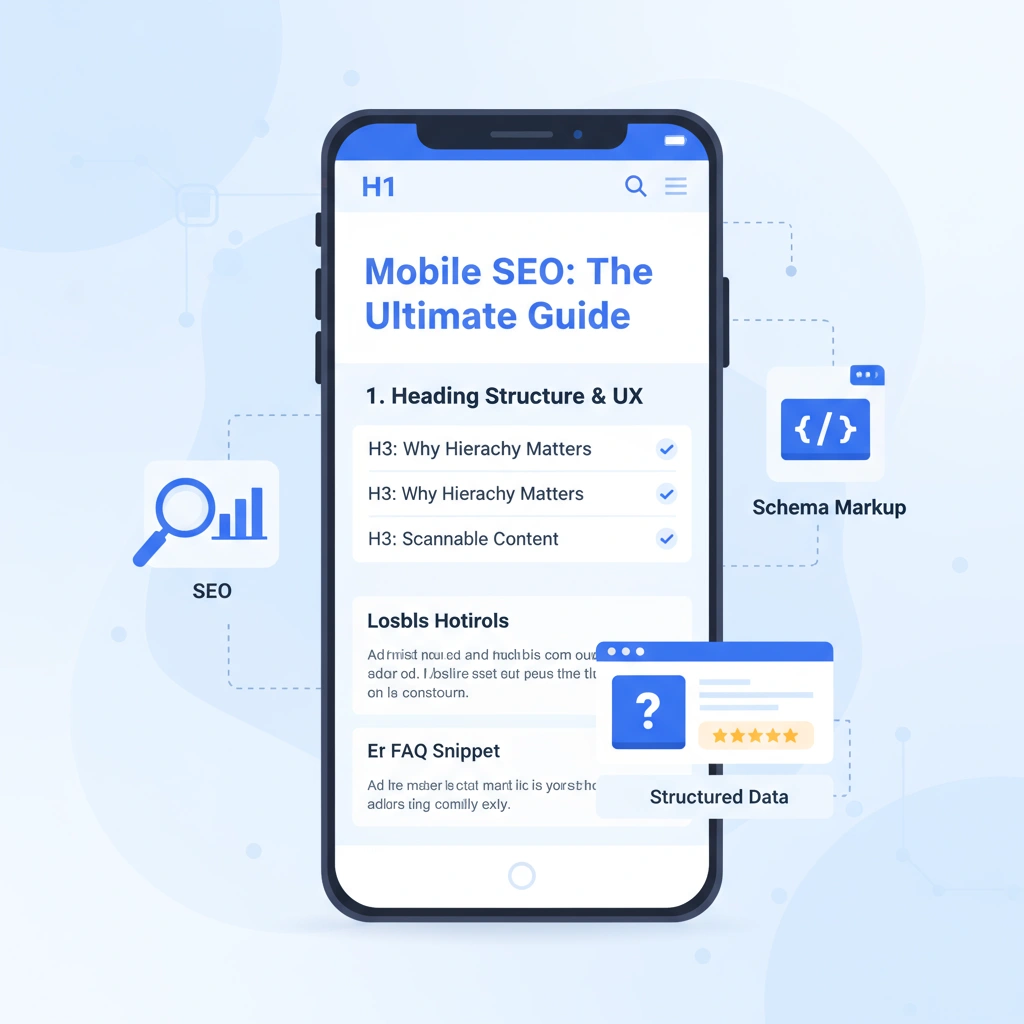
This ties seamlessly into robust on-page SEO practices. Mobile-friendly headings guide both crawlers and users effectively. Keep H1’s concise and use H2-H4 for a clear hierarchy.
Schema markup enriches elements such as FAQs and products. It makes your content easier for search engines to interpret. This increased clarity leads to more prominent search results.
Leverage Structured Data for Rich Mobile Results
Leveraging structured data effectively unlocks rich snippets in search results. These include star ratings, prices, or event details. Rich snippets significantly expand your mobile search footprint.
These enhanced listings boost click-through rates by up to 30%. They also improve visibility in voice searches. This works across all major platforms and devices.

Implementing proper schema markup reinforces algorithmic favor. It signals well-organized mobile experiences to search engines. This demonstrates your content quality and technical optimization efforts.
Modern SEO Topics in Mobile Optimization
The 2025 SEO landscape combines mobile optimization with AI-driven changes. Search engines now use generative overviews and semantic understanding, requiring strategies beyond traditional speed and design improvements to maintain visibility.

How Click-Through Rates (CTR) Influence Mobile Rankings
CTR signals content relevance to search algorithms. Mobile sites with compelling snippets that clearly articulate value propositions attract more clicks, which, in turn, improve rankings. The top mobile result currently captures 27.7% of clicks, though AI overviews have reduced this slightly.
To boost CTR, create titles under 60 characters that use action words and clearly state your solution. Asian e-commerce platforms report 20-25% improvements in ranking from refined snippets that counter AI-driven traffic loss in competitive markets.
Google’s AI Rewrites and Mobile Snippets
Google’s Gemini AI rewrites meta descriptions 70% of the time, pulling content directly from pages to match search intent. While helpful, complete AI replacements can reduce traffic by 30% through mismatched snippets.
Counter this by writing naturally flowing content with specific terms that help AI understand your page purpose. For global reach, blend English with local languages to create hybrid snippets that improve visibility across regions.
AI Tools’ Evaluation of Mobile Content
AI systems like ChatGPT and Gemini use natural language processing to evaluate content quality and search potential. Currently, 64% of SEO professionals use these tools, cutting content tasks by 50% while improving performance predictions.
Optimize with clear headings, verified facts, and concise writing. This approach increases AI tool citations by 30%, bringing indirect traffic even as traditional clicks decline. Sites featured in Perplexity or Copilot gain visibility through this new search ecosystem.
Testing and Monitoring Your Mobile Site
Your mobile site needs regular checkups to stay competitive. Without consistent testing, optimizations can fail as technology evolves. Fortunately, effective monitoring doesn’t require expensive tools.

Free Tools for Mobile Site Checks
Google Search Console alerts you to mobile issues and shows how Google views your site. For quick assessments, use Google’s Mobile-Friendly Test to verify pages work on smartphones. Page Speed Insights analyzes Core Web Vitals and provides specific improvement suggestions.
Lighthouse offers comprehensive audits within Chrome, checking performance, accessibility, and SEO. Bing’s Mobile Friendliness Test provides an alternative perspective that sometimes catches different issues.
Methods for Regular Monitoring
Schedule monthly tool audits to spot problems early. Check analytics weekly for mobile traffic changes and bounce rate spikes. These metrics reveal when something needs attention.
Test your site manually across various devices, as automated tools may miss some issues. Set up alerts for ranking drops or increases in errors to fix problems quickly.
The Value of Data-Driven Adjustments
Let numbers guide your decisions. Focus on changes that improve user metrics and rankings. When bounce rates drop after speed improvements, you know what works.
This approach builds search engine trust and industry authority. Sites that consistently deliver quality mobile experiences gain lasting competitive advantages. By fixing issues proactively and adapting based on user data, you stay ahead of competitors while serving your audience better.
Build a Mobile-First Future with Expert Help
Mobile optimization effectively transforms websites from slow, frustrating experiences into fast, engaging platforms that users love and search engines reward. By implementing responsive design, improving site speed, and creating thumb-friendly navigation, you consequently boost both rankings and conversions.
Therefore, start by testing your current mobile performance today. While these strategies certainly provide a solid foundation, achieving optimal results often requires specialized expertise. That’s why SEO Services BD helps businesses worldwide implement advanced mobile optimization strategies that drive measurable growth.
Ultimately, don’t let mobile issues cost you customers. Instead, assess your site now and consider partnering with professionals who understand the complexities of global mobile SEO success.
FAQ
What is mobile optimization?
Mobile optimization is the process of designing or updating a website so it works seamlessly on smartphones and tablets. This includes ensuring the site loads quickly, displays correctly across all screen sizes, and is easy to navigate with touch controls. It also involves optimizing content, images, and forms for mobile users to ensure a smooth, user-friendly experience.
Why is mobile optimization important?
- Over half of global web traffic comes from mobile devices, making mobile optimization essential for reaching and retaining users.
- Google uses mobile-first indexing, meaning the mobile version of your site is the primary basis for search rankings.
- A mobile-optimized site improves user experience, reduces bounce rates, and increases conversions and sales.
What’s the difference between mobile-friendly and mobile-optimized?
Mobile-friendly websites meet a minimum requirement of usability to rank higher in Google searches. A mobile-friendly website is designed for desktop, but scales down to fit on a mobile device. Let’s contrast mobile-friendly with mobile-optimized. A mobile-optimized website serves users with a version designed specifically for mobile devices. Mobile-optimized sites actually redesign elements for mobile users, while mobile-friendly sites shrink desktop content.
What are the key elements of mobile optimization?
| Element | Description |
|---|---|
| Responsive Design | Layout adapts to any screen size or orientation. |
| Fast Load Times | Pages load quickly, even on slow networks. |
| Touch-Friendly Navigation | The text is clear and easy to read without zooming. |
| Readable Content | Text is clear and easy to read without zooming113. |
| Optimized Images | Images are compressed and sized for mobile screens. |
| Mobile-Friendly Forms | Forms are simple, with large input fields and minimal steps. |
| Schema Markup | Structured data for rich snippets in search results. |
Does mobile optimization really affect my Google rankings?
Yes, significantly. Mobile optimization contributes to higher search engine rankings. Google rewards mobile-friendly sites with better search visibility. This is particularly important with Google’s mobile-first indexing. Since Google now uses mobile-first indexing, your mobile site is what primarily determines your search rankings.
How often should I check my mobile optimization?
Monthly audits are recommended to catch new issues early. Set up regular monitoring through Google Search Console’s Mobile Usability report and test your site on various devices quarterly.